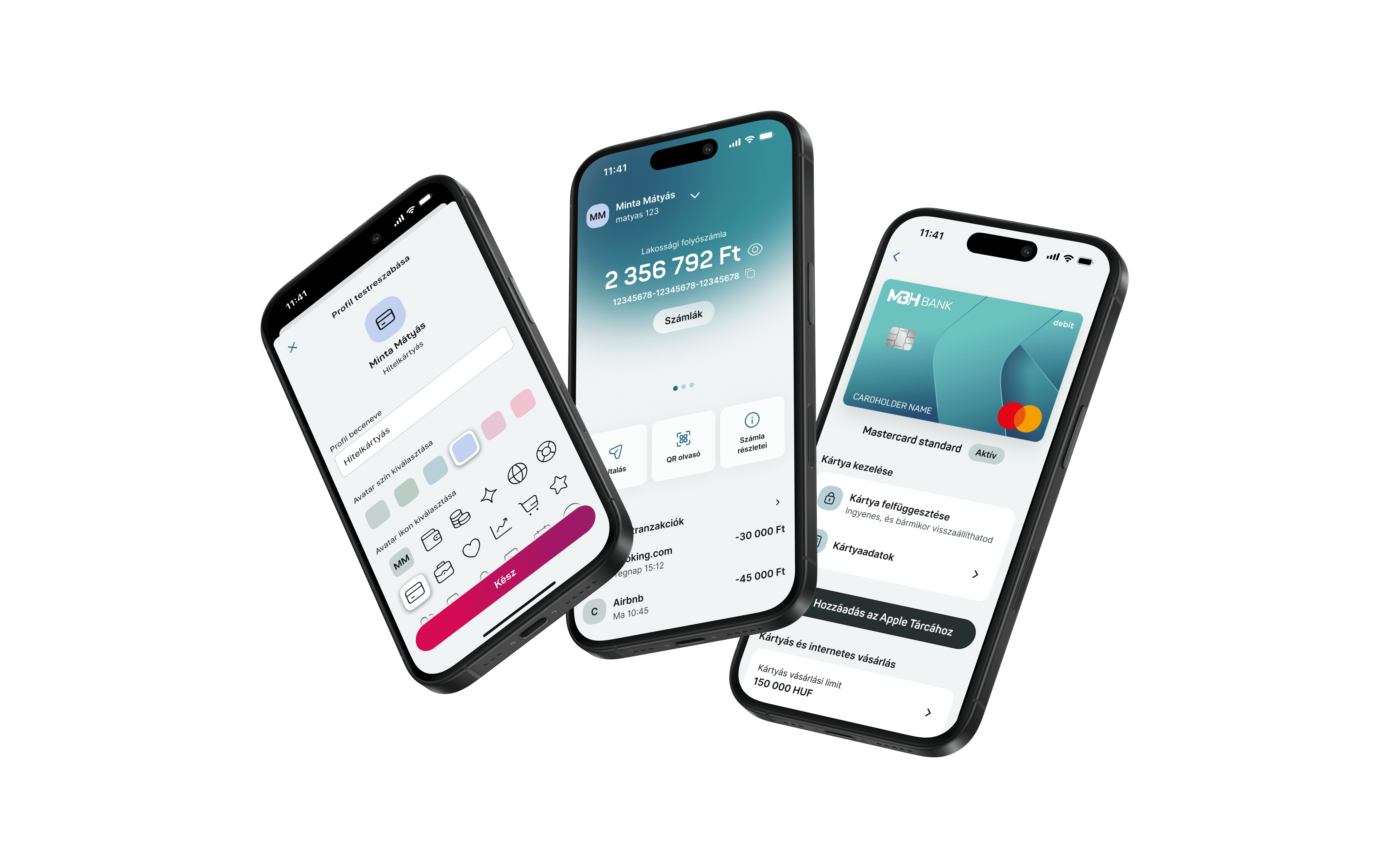
Transforming legacy daily banking
How user-centered design and diplomatic stakeholder management transformed a fragmented three-bank mobile app into an intuitive experience that users actually enjoy using.
my role
UX researcher
Design manager
UI designer
Project manager
constraints
Tight project timeline
Legacy back-end limitations
Fluctuating team composition
3 merged but unconsolidated systems

Challenge
MBH Bank's app reflected three merged banks with unconsolidated systems, requiring us to work around fragmented infrastructure while modernizing outdated design patterns. As a design-driven project, I led user requirements definition and stakeholder collaboration to create an intuitive banking experience for thousands of users.
Solution
We developed streamlined user flows and a modern UI, the solution focused on simplifying complex banking tasks through accessible design patterns and a cohesive visual system that worked seamlessly across the consolidated platform, ensuring consistency despite the underlying technical complexity.
research & discovery

Methods used
NPS survey analysis from in-app questionnaires
Open card sorting sessions to understand user mental models
Competitive benchmarking
Stakeholder interviews
Key findings
Information architecture
Users couldn't predict where to find specific features due to inconsistent categorization and menu structures.
Outdated UI
Inconsistent visual elements and outdated design standards left users uncertain about how to interact with key features.
Outdated patterns
Outdated interaction patterns added unnecessary steps which frustrated users expecting streamlined modern app experiences.
design process

Info architecture redesign
Identified navigation problems: Analyzed NPS data revealing navigation confusion as the primary source of user frustration
Rebuilt structure using user research: Conducted open and closed card sorting sessions to align menu architecture with users' mental models
Delivered intuitive pathways: Transformed cluttered, illogical menus into clear navigation that matches how users think about banking
Wireframing
Separated structure from visual design: Started wireframing while visual identity was in development to focus purely on functionality
Enabled early validation: Facilitated stakeholder and user testing of core flows before investing in high-fidelity designs
Prevented visual bias: Kept discussions focused on usability decisions rather than visual preferences during critical structure phases

Look&feel concepts
This collaborative phase was particularly challenging since MBH's current digital presence felt outdated, but brand decisions remained with marketing and their agency, we didn't want to overstep boundaries with unsolicited suggestions. However, the existing brand colors posed accessibility issues, forcing us to diplomatically propose alternatives while navigating cautious decision-makers who were naturally hesitant about change.
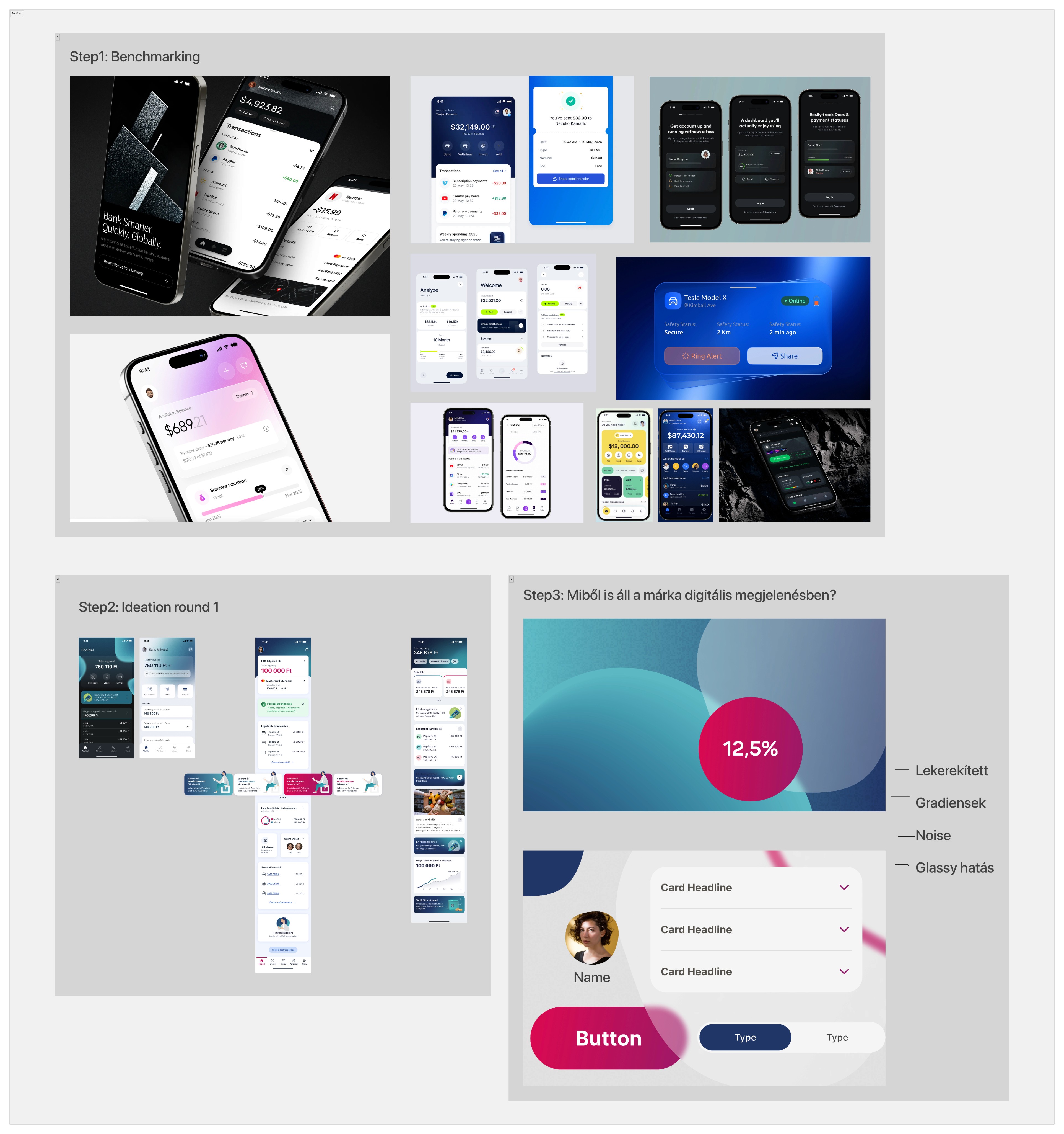
We began by extensively gathering inspiration across Dribbble, Behance, and Mobbin to understand current UI trends and what modern banking interfaces could offer. I focused on contemporary UX/UI patterns and usability best practices, creating our own interpretations that could work within MBH's constraints. We then carefully explored the bank's existing brand identity, what it represents, its visual DNA, and how we could respectfully evolve these elements into a fresh, accessible app experience.
Through multiple design iterations and diplomatic critique sessions, we systematically evaluated concepts while balancing innovation with organizational comfort levels. This delicate process of creation, feedback, and gentle persuasion ultimately produced a final concept that honored MBH's brand heritage while meeting modern design standards, accessibility requirements, and user expectations.


Collaborative approach
Regular alignments
Consistent check-ins with POs and developers ensured everyone stayed aligned on goals and prevented costly rework down the line.
Testing reduces risk
Continuous validation cycles caught usability issues early, allowing for quick adjustments before major development investment.
Built accessibility first
Integrating accessibility considerations throughout the design process created inclusive experiences without retrofitting or delays.
Additional responsibilities
Project documentation
Created comprehensive roadmaps and project documentation to maintain clarity on priorities and ensure all stakeholders had a shared understanding of progress and timelines.
Cross-functional coord
Served as the primary liaison between development teams, POs, and business stakeholders, streamlining communication and preventing misalignment across departments.
Project management
Managed project deliverables, tracked progress against milestones, and coordinated resources to maintain momentum and prevent scope creep throughout the redesign process.
solution

Redesigned interfaces
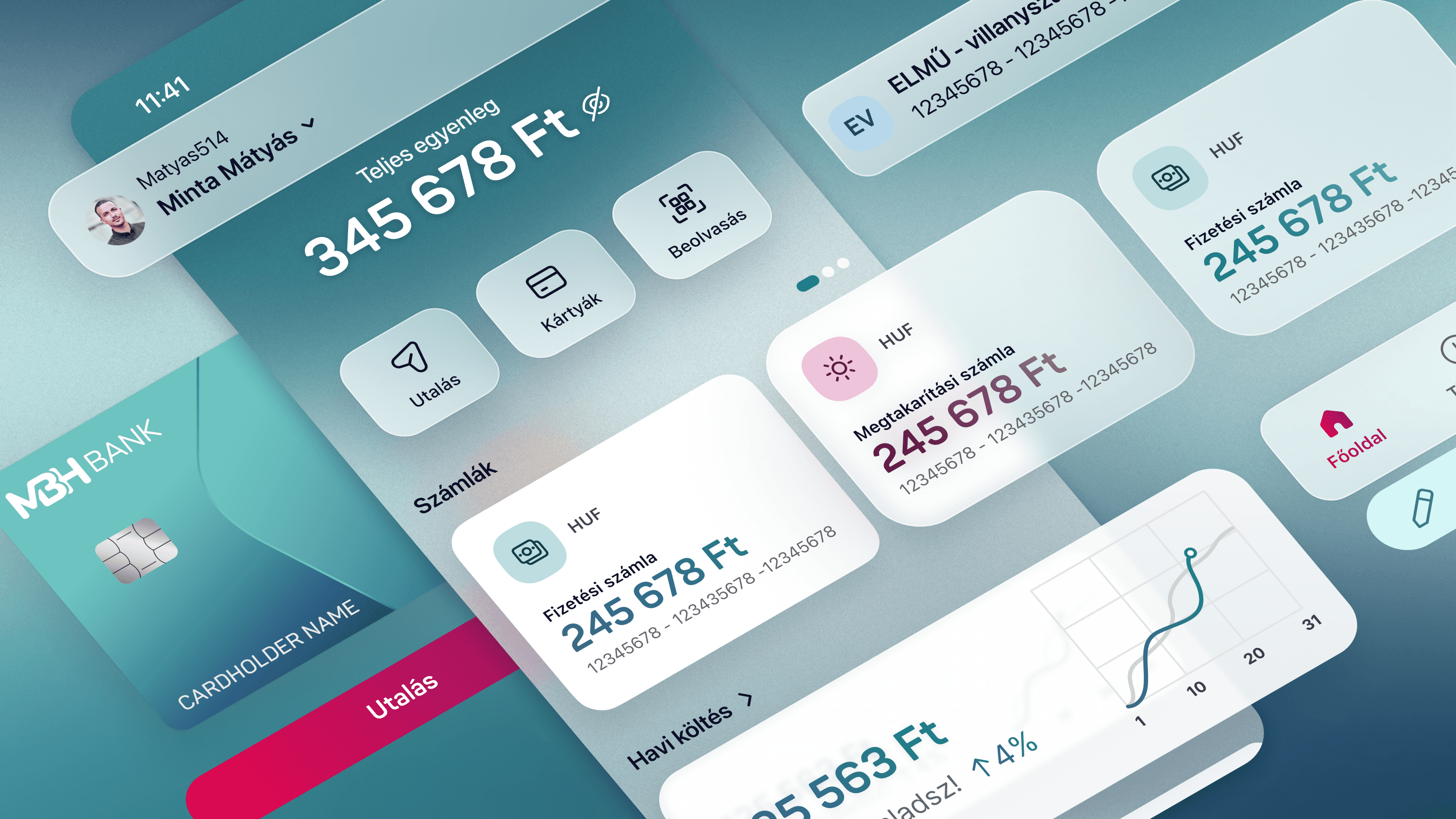
The redesigned app features intuitive navigation flows, clean modern interfaces, and accessible design patterns that prioritize user needs. Below are key screens showcasing the fresh visual identity, streamlined user journeys, and cohesive design system that transformed the banking experience into something users actually enjoy using.

retrospective
This project reinforced the value of research-driven design decisions and cross-functional collaboration. The biggest learning was balancing multiple roles while maintaining design quality, next time I'd establish clearer delegation strategies to focus more deeply on user experience validation.
Takeaways
Involve devs early on
Bringing developers into design discussions from day one prevented technical roadblocks and accelerated delivery.
Compromise with BAs
Collaborating with BAs to balance user needs with business requirements created sustainable solutions and stakeholder buy-in.
Research validates ideas
Data-driven insights from NPS analysis and card sorting transformed subjective preferences into objective design decisions.